기본적인 의사 클래스 이벤트
:hover
사용자가 요소 위에 마우스를 올렸을 때 스타일을 변경할 때 사용합니다.
일반적으로 버튼, 링크 등의 강조 효과에 많이 사용됩니다.
:focus
사용자가 요소를 포커스(클릭하거나 키보드 Tab으로 이동)했을 때 적용됩니다.
주로 input, textarea 같은 폼 요소에 사용됩니다.
:active
사용자가 요소를 클릭하고 있는 동안 적용됩니다.
버튼을 클릭할 때 눌리는 효과를 만들 때 유용합니다.
:target
:target은 URL의 해시(#id)가 해당 요소를 가리킬 때 적용됨.
주로 앵커링(페이지 내 이동)과 모달/토글 효과 등에 활용됨.
:focus-visible
:focus와 유사하지만, 키보드로 포커스할 때만 적용됩니다.
마우스로 클릭하면 :focus-visible이 적용되지 않음.
:visited
방문한 링크(a 태그)에 스타일을 적용할 때 사용합니다.
transition
`transition`은 어떤 속성이 변경될 때 부드러운 애니메이션 효과를 추가하는 속성입니다.
//transition: property duration function delay
.box {
  transition: opacity 0.5s ease-in-out,
              transform 0.5s ease-in-out;
}
See the Pen Untitled by wooyeon (@wooyeon06) on CodePen.
대상속성
[Box model]
width, height, margin, padding, border 적용 가능
<div>, <section>, <article>, <header>, <footer>, <aside>, <main>, <nav>, <p>, <h1> ~ <h6>, <ul>, <ol>, <li>, <table>, <form>
- width height, max-width, max-height, min-width, min-height
- padding, margin
- border-color, border-width, border-spacing
[Background]
- background-color, background-position
[좌표]
- top, left, right, bottom
[텍스트]
- color font-size, font-weight, letter-spacing, line-height
- text-indent, text-shadow, vertical-align, word-spacing
[기타]
- opacity, outline-color, outline-offset, outline-width
- visibility, z-index
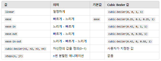
timing-function
timing-function은 애니메이션의 속도 변화를 조절하는 역할을 합니다.
transform
`transform`은 요소의 위치, 크기, 회전 등을 변경하는 속성입니다.
주요 기능은 다음과 같습니다:
2D

3D

See the Pen Untitled by wooyeon (@wooyeon06) on CodePen.
@keyframes, animation
animation: 애니메이션이름 지속시간 대기시간? 타이밍함수? 반복횟수? 반복방향? 전후상태? 재생/정지?;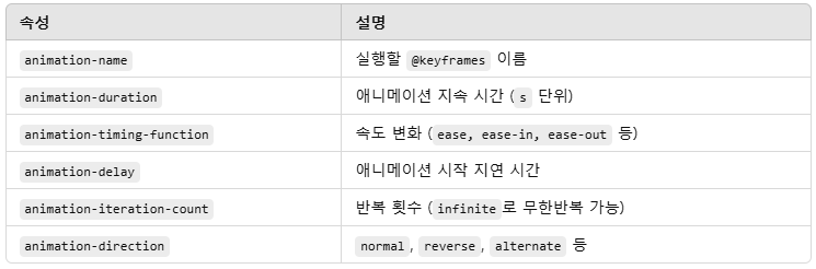
/* from-to */
@keyframes 애니메이션이름 {
  from {}
  to {}
}

/* percentage */
@keyframes 애니메이션이름 {
  0% {}
  50% {}
  100% {}
}
See the Pen Untitled by wooyeon (@wooyeon06) on CodePen.
🔥 주요 주의사항
- display: inline;이면 hover가 적용되지 않음
- 몇몇 모바일 브라우저는 hover 이벤트 자체를 무시할 수도 있음.
- display: none; → display: block; 변경할 때 transition 적용 불가.
- width와 height 대신 transform: scale() 사용 권장
- inline 요소에는 transform 적용 안 됨!
- absolute 또는 fixed 요소를 transform할 때 부모 요소의 overflow: hidden;이 있으면 애니메이션이 잘릴 수 있음.
https://www.heropy.dev/p/26YKpK
CSS Animation 완벽 가이드
CSS Animation(애니메이션)은 여러 CSS 스타일 속성으로 요소의 크기, 색상, 모양 등을 제어해 애니메이션 효과를 부여하는 기술로 자바스크립트 없이도 요소에 동적 효과를 부여할 수 있어, 보다 좋
www.heropy.dev
https://inpa.tistory.com/entry/CSS-%F0%9F%93%9A-%ED%8A%B8%EB%9E%9C%EC%A7%80%EC%85%98-%ED%8A%B8%EB%9E%9C%EC%8A%A4%ED%8F%BC-%EC%95%A0%EB%8B%88%EB%A9%94%EC%9D%B4%EC%85%98
'WEB개발 > PUBLISHING' 카테고리의 다른 글
| [PUB] position, display, line-height, letter-spacing (0) | 2022.12.07 |
|---|---|
| [PUB] position (0) | 2022.08.10 |
